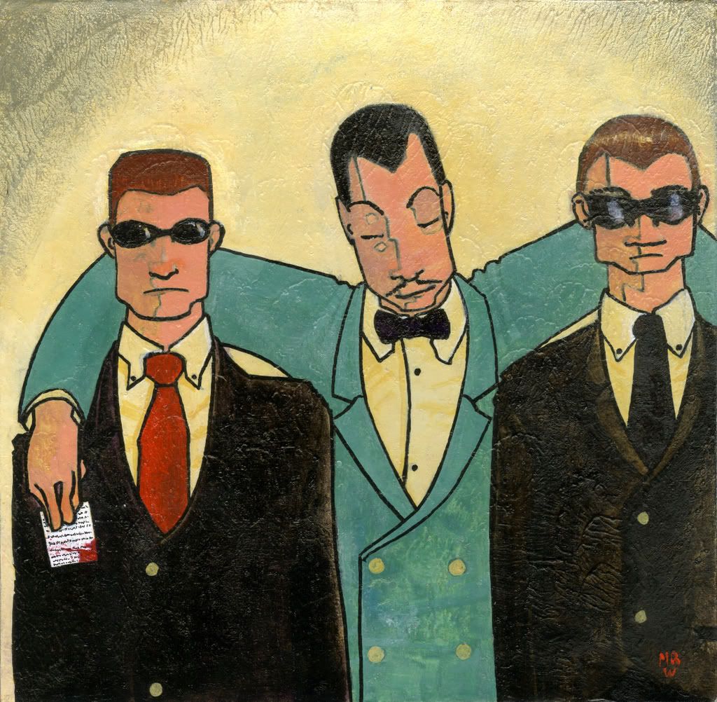
I'm done done done done. YAY!
EDIT: Some of you have been complaining of the large files crashing your systems. Wimps. But I like y'all, so I swapped out the images files, but theere are still links to the larger images because I want to make sure that the texture I SLAVED over is visible. Dangit.
HQ LinkEDIT: Some of you have been complaining of the large files crashing your systems. Wimps. But I like y'all, so I swapped out the images files, but theere are still links to the larger images because I want to make sure that the texture I SLAVED over is visible. Dangit.

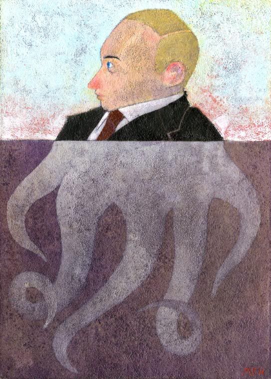
Editorial Illustration: a caricature (sort of) of Vladimir Putin.
Least favorite assignment, but one of my favorite pieces, that texture on the tentacles was REALLY fun to do. And of course during the whole assignment my classmates and I were making really mature jokes about his name. "PU-tin!" Anyone that's heard 'Space Ghost's Musical BBQ' will understand.
"No I don't think so."
The assignment was to take a traditional visual symbol and then re-use it in a stronger way.
So I chose "halo."
I don't think it worked.
But I like my turquoise sky.
 HQ Link
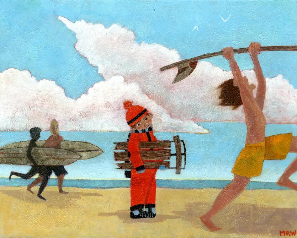
Editorial Illustration for an article about how sleds are being bought less and less. Sad day!
Technical note: the whole point of this Illustration class was to let us explore the uses of high-viscosity (heavy body) acrylic paint, and see what textures. I'm beginning to understand...
 HQ Link
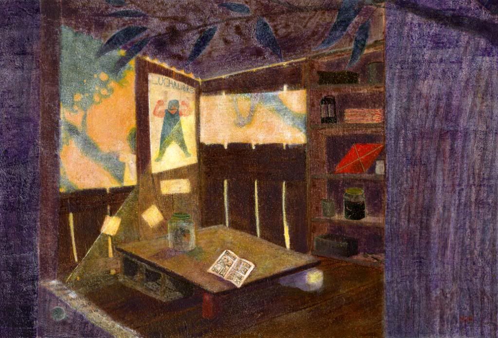
So Courtney Granner [link] came to visit and he requested that we do an illustration of a tree house for him to rip apart. I mean critique.
It was fun, but I'm not so much into architecture, although I really appreciate it. I like roofs. And floors.
He's the head of the Shrunkenheadman Club. Check it out. Their stuff kicks my arse.
 HQ Link
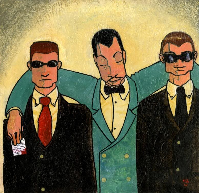
Editorial Illustration for an article about how the FBI was using mobsters for information and then protecting them in return.
I had to go back and totally re-design this, but I'm glad I did, I like this image WAY more than the first.
 HQ Link
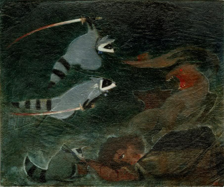
The assignment: illustrate a scene from a book. So I chose the most obscure science fiction novel I could called Out On Blue Six. You know, I don't think it's ever explained what that MEANS. Oh well.
But the point is there's Battle Raccoons, and it's awesome. In this scene they're rescuing a political refugee from flushed pets. In the sewers. And they have swords. They are also described as having cross bows, but I didn't want to deal with that.
I had to mess around with this image a little in Photoshop because the texture was doing wonky things with the scan. I think it worked.
 HQ Link
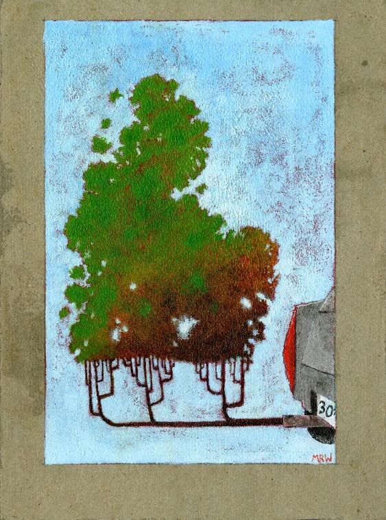
Editorial Illustration: for an article about trying to plant trees to offset CO2 usage, and how it doesn't work the way people think it does...
Possibly my favorite piece this year so far. I really like trees. REALLY LIKE 'EM.
 HQ Link
Bees rule.
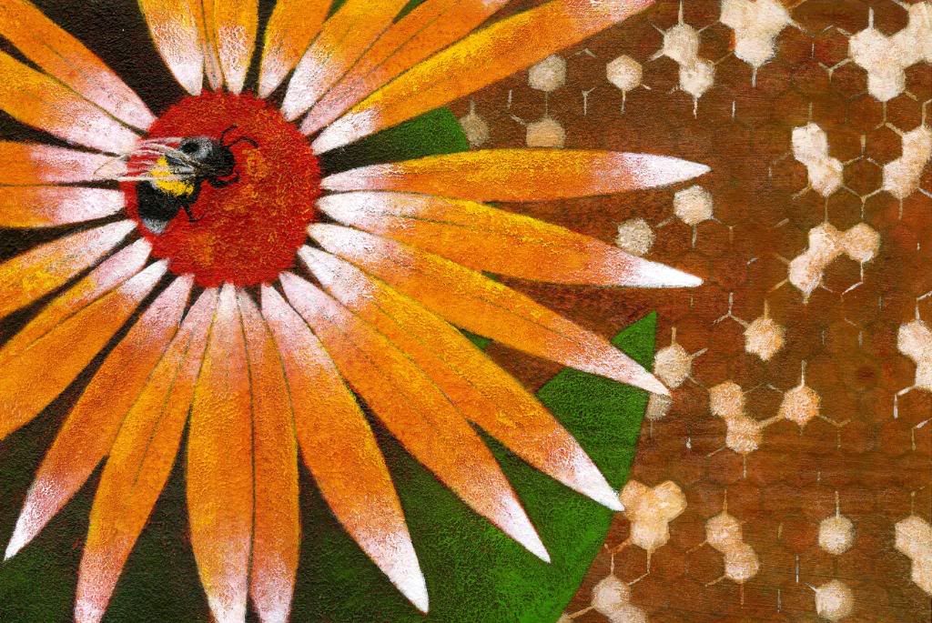
The assignment was to choose an abstract word and then try to illustrate it.
I totally had to re-do this one because my first attempt at 'saturation' SUCKED. So I chose 'energy' and got to paint a bee and life was good.
I'm really sad to hear about the weird and mysterious disappearance of bees. Four years. If bees go the world's got four years. And then we all die.
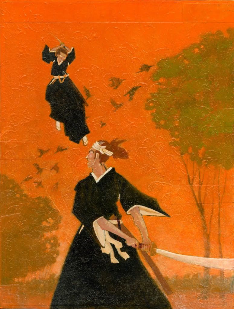
I'm re-uploading the orange one because I did some re-painting and made some minor changes, plus the scan is better.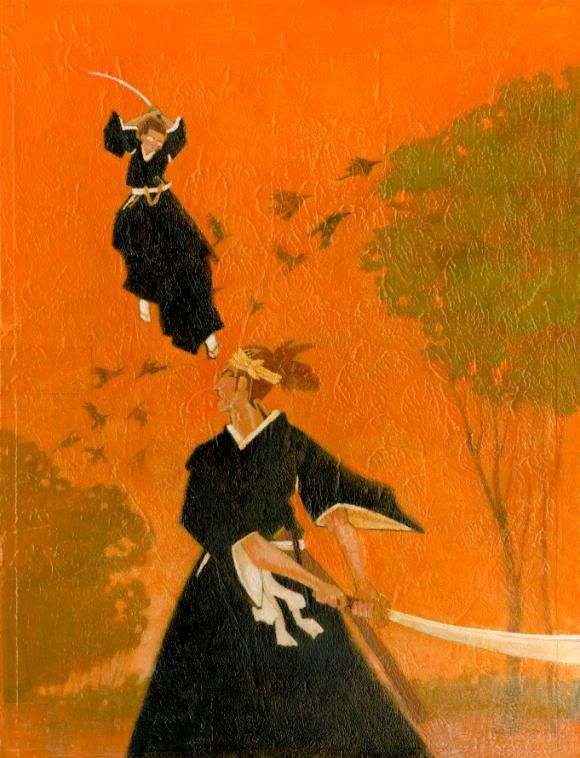
HQ Link
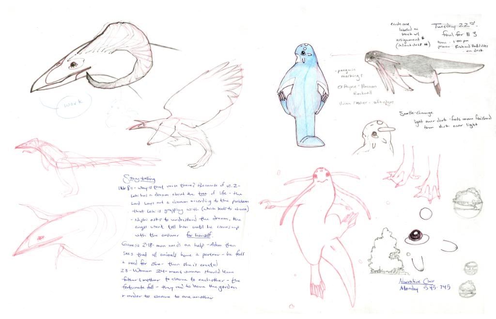
I went to the zoo yesterday and I'm going to the Aquarium today, so I'll try to get those pages scanned before I go home.
